Lets touch on an important point that most of you are probably aware of, or can probably guess is an important element of web presence – mobile responsive websites. You might have noticed that just about everyone these days has a cell phone, tablet, or some variation of the two, and most of them use these devices to search the web. Unfortunately most of what users are searching for these days is not mobile responsive, even though much of what people use to search the internet is a mobile device. So it is our responsibility as practitioners of the web to offer our users a responsive mobile experience. Building a mobile responsive site is not inherently that difficult, in fact most platforms that are designed for beginners have mobile friendly themes built right into them.
Here’s a handful of reasons why your website needs to be mobile friendly.
1) Looks Better
Obviously a huge reason you want to have a mobile responsive sight is because it simply looks better. Seeing your website across all platforms, looking as clean as it does on a computer screen is pleasing, especially when you didn’t have to do any extra work for it to happen. Obviously its not just how it looks to you, but your viewers will also appreciate its mobile design features.
2) Ranks Better
Google and other leading search engines know that users desire a mobile friendly design, so they typically index them better in their SERP’s (Search Engine Results Pages). Also, the design of mobile responsive sights generally carry less code and are leaner and meaner, so they run more efficiently, which means faster page loads and better on page experience.
3) Low Bounce Rate
Bounce rate refers to the percentage of people who lose interests in your site and leave your web page before they had a chance to check out more than one page. A high bounce rate indicates to Google that your site offers users little value, and does not interests viewers to want to hang around. If no one wants to stay on a website beyond the home page, then Google won’t want to offer this website to users in their SERP’s. Since many people are using cell phones and mobile devices to search these days, chances are users won’t hang around on a site if its not responsive since information is hard to find and disorganized. So decrease your bounce rate by offering viewers a mobile friendly site that is easy to navigate through on mobile devices.
4) Converts Better
If your page is not mobile friendly chances are your conversions are pretty low as well. Conversions refers to the amount of people you get to do a desired action. This may involve purchasing something, clicking on something, or submitting contact information. This can be a hard task to perform for website visitors if the information is not displayed in an organized easy to navigate way. There is a lot that goes into getting visitors to convert, but one of the biggest ways to improve conversions is by simply offering them a mobile responsive website.
5) It’s Easy To Do
Like I said earlier, most web design platforms have responsive designs built in, so it literally takes no effort on your part. Many of the WordPress themes now come standard with HTML5 formatting, which was designed to perform and look wonderful on all devices. I know that Weebly and other user friendly platforms also offer this capability, just make sure the theme you choose clearly indicates that it is mobile friendly.
Ways to indicate a site is mobile friendly.
1) Theme Description
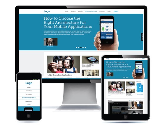
Again most themes that you use online these days will indicate in their description whether or not they are mobile friendly. Although most themes are mobile friendly, I would stick to one that clearly states its responsive in the description. Often times the theme will show images of what it would look like on mobile devices so you can clearly see before moving forward (like the image for this post).
2) Compress The Screen
A very useful trick to test if a current website is mobile responsive is to compress the screen. By simply grabbing the corner of the screen and minimizing the size of the screen you can discover if a site is mobile responsive. As the screen compresses the content will either adjust to fit the screen or it will simply disappear off the screen. Once you have minimized your screen to the size of a cell phone, the way the content adapted to this formatting will indicate whether or not its responsive. If the content went off the screen then the site is not mobile friendly, if it stayed on the page and reformatted itself to still be visible and readable then it is mobile friendly. This is a great way to check a clients site, or check your own site that you may have already built out.
3) Ask Google
The most trustworthy of all these methods is to ask Google directly. Google over the years has rolled out some really useful tools for web builders and people in the online community. They offer a whole bunch of analytics tools, and one in particular for those seeking to test if there site is mobile friendly or not, which they simply refer to as the mobile friendly test. By simply imputing your url into the box you will get back a detailed report about the specifics of your sites responsive design. This can be extremely useful to offer clients as a report, as well as a tool for locating any errors that you can repair, which will improve how responsive your site is across all platforms.
Conclusion
As we travel further in time, it will be increasingly important to ensure your website is mobile responsive, both for visitors and search engines alike. Though it is already important, it will soon be a necessity to have a responsive website, in order to be discovered on the search engines, since this will inevitably be a requirement by Google and others.
If there was not enough information present in this post to get you on the right track, then seek out additional information on creating a mobile responsive website. Like I said, Google itself offers enough information on the subject to fully equip you with all you need to know, to successfully create a website that’s friendly across all platforms. Your website deserves the best, so make sure you give it that modern responsive look and feel.
Until next time


